Why good design matters
When a designer is faced with the challenge of designing to meet WCAG standards, the toolkit at their disposal is often hugely reduced. There are restrictions around using typography, colour and composition – the core fundamentals of design.
Essentially, we must remember why creativity and good design is important.
This quote summarises the point perfectly.
“What’s the use in being legible, when nothing inspires you to take notice of it?”-
Wolfgang Weingart
When we remember that engagement is often the aim of design and marketing, we remember that all people - including those with impairments - enjoy visually and linguistically engaging content.
Sometimes one is more important than the other
Before we give the impression that accessibility is less important, there are many occasions where accessibility must come first. Any information that’s vital to the reader (and informational in nature) must be handled in a way that’s sensitive to a wide array of impairments and disabilities – the ones we account for when designing to WCAG standards.
But at the same time, we also need the ability to distinguish between the importance of communicating vital information (that the user absolutely needs) and something decorative and there purely to engage and excite – like a strapline or a catchy headline.
This is where balance is essential. If we ignore accessibility in content creation or leave it as an afterthought, we exclude people. On the flip side, if the aim of a brief is to engage and entertain, designing everything to look like the Gov.uk website* won’t exactly fit the bill.
*For the record, we love Gov.uk – it’s a brilliant informational piece of design.
So how can we strike this balance?
- Make a distinction between vital and non-vital information.
Ask whether the aim is to inform or to excite – and design accordingly. If the non-vital content is being treated in a way which doesn’t meet accessibility standards in your design, repeat this information in the body copy so it doesn’t get missed.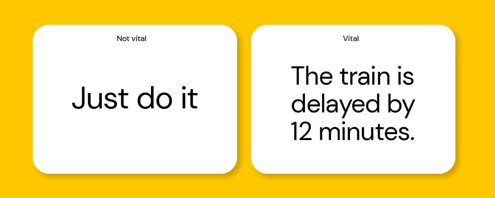
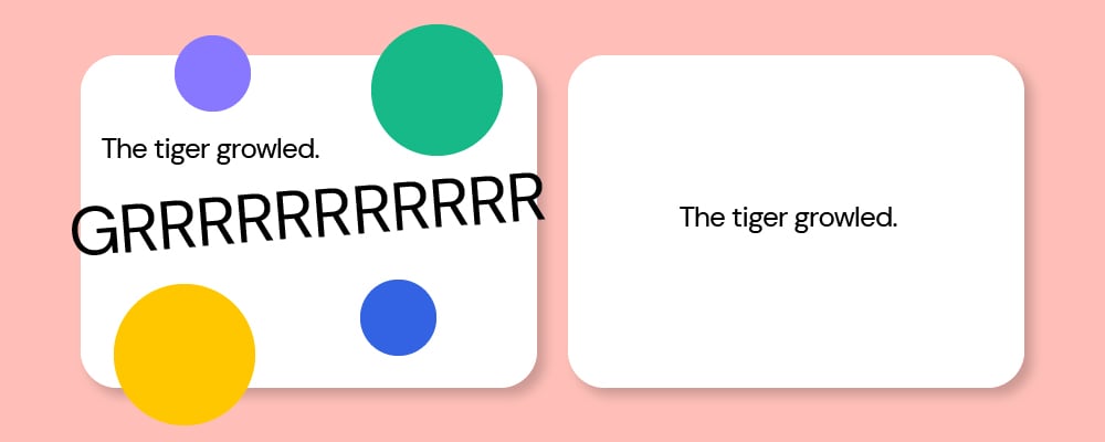
- Designing for your key audience is still the priority.
If you’re designing for a very young audience, it’s going to have to be fun and playful to have any impact. Find a balance whereby the main content is accessible, but you can still use creative expression.
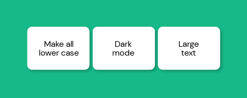
- Use tech to allow for more options.
There are many great AI features you can use on websites to make your digital content more accessible, such as dark mode, double font size and ADHD friendly browsing. We used these features to our advantage when designing a microsite for GMCA’s foster carer recruitment campaign.
- It's not what you use, it's how you use it.
Often we see certain colours or fonts and immediately jump to the conclusion that a colour like yellow or an uppercase font is simply not accessible. But if we dig a little deeper, we can find nuanced ways of using these that work for everyone.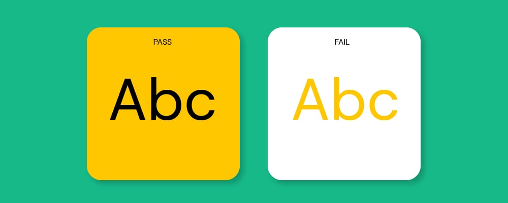
- Use good typography principles.
Set your type with accessibility in mind, following key accessible design principles on things like leading and tracking.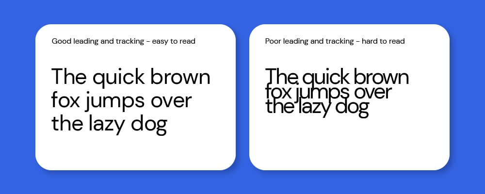
An ongoing commitment
The quest for the right balance between good design and accessibility isn’t a one-time endeavour - it's an ongoing commitment. When executed correctly, accessible design can enhance the user experience for everyone and broaden your website's reach. Remember that accessibility isn't just about compliance; it's about inclusivity and making the web a better place for all users, regardless of their abilities. By prioritising accessibility in your design process, you can create content that isn’t just visually appealing but also truly accessible to all.
Accessibility is never just a tick-box exercise. For more information about why accessibility is important and what it means for your marketing, download our free e-book.
Originally published:
September 8, 2023
Updated:
December 20, 2023


